Whether AI built your site or you started from a template, every Buildan.app site is edited in the same visual editor. Spend ten minutes learning where things live and you will work much faster for the rest of your site's life.
This tour walks through the editor from top to bottom, then shows the shortcuts and menus that save the most time.
What you need
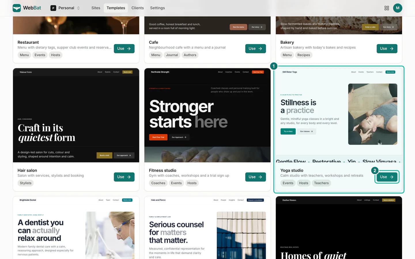
- A Buildan.app account and a site to open. Any site will do; we use a yoga studio made from a template. See Start from a template, or a blank page if you do not have one yet.
- A computer or tablet gives you the full editor. On a phone you get a simplified version, covered at the end.
The layout
Step 1: Get to know the four areas
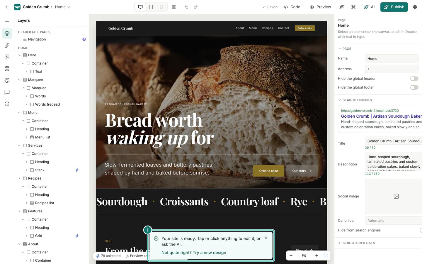
Open a site from your dashboard and the editor fills the window. It has four areas:
- The top bar with the page switcher, breakpoints, undo and redo, preview and publishing.
- The left rail and its panel: icons that open Insert, Layers, Pages, Assets, CMS, Theme, Comments and History.
- The canvas: your real page, rendered as visitors will see it. Click anything to select it.
- The inspector on the right, which shows the settings for whatever is selected.
At the bottom of the canvas you will also find a small motion bar with Preview animations and the Timeline, and the zoom controls.
The top bar
Step 2: Switch views and undo
On the left of the top bar you see your site name and the current page. Click the page name to jump to another page.
In the middle are the view controls:
- Desktop, Tablet and Mobile view. Press 1, 2 or 3 to switch. Style changes you make on tablet or mobile only apply to that size and smaller, so you can adjust a layout for phones without touching desktop.
- All breakpoints side by side, which shows the page at all three sizes at once.
- Undo and Redo, also on ⌘Z and ⌘ShiftZ.
Step 3: Preview, ask the AI and publish
On the right side of the top bar, from left to right:
- Saved shows that your changes are stored. Buildan.app saves automatically about a second after each change, and ⌘S saves straight away.
- Code opens code mode, where you can edit the whole site as HTML and CSS.
- Preview opens your draft exactly as visitors will see it (⌘P).
- The wand icon is Try a new design, which suggests fresh looks for the whole site.
- The ⌘ icon opens the Command palette (⌘K).
- AI opens the AI editor (⌘J), where you describe a change in plain words and review it before it is applied.
- Publish puts your site live, or schedules it.
Nothing you do in the editor is visible to visitors until you publish.
The left rail
Step 4: Open a panel from the left rail
The narrow column of icons on the far left opens one panel at a time. Click an icon again to close its panel.
- Insert (/): sections and elements to add to the page.
- Layers: the page as a tree. Click a row to select it, drag rows to reorder, and hover a row to hide it on the current breakpoint.
- Pages: every page, the CMS item page designs, and your site menu.
- Assets: your uploads and a library of free photos.
- CMS: the content collections behind lists such as blog posts, events or team members.
- Theme: site wide colours, fonts, shapes and spacing, plus design directions and the style library.
- Comments: notes pinned to the page or to an element, for your team or your client.
- History: saved versions of your site. Use Save version before a big change, and restore any earlier version later.
Selecting and the inspector
Step 5: Select an element
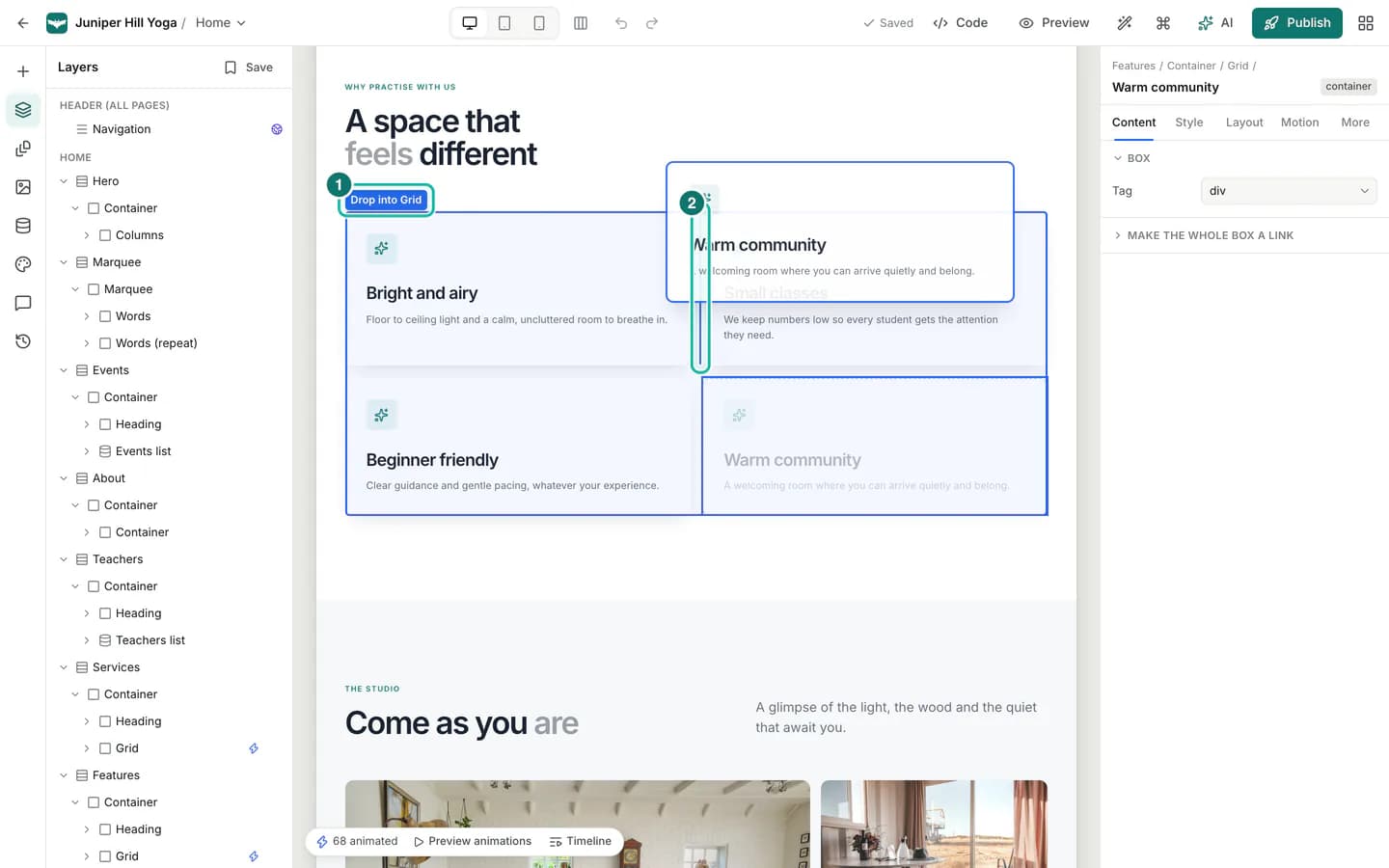
Click anything on the canvas to select it. A blue selection bar appears above it with the element's name and quick actions: drag handle, select parent, move up and down, font, duplicate, delete and ask the AI.
The inspector on the right updates to match. At the top you see where the element sits on the page, as a trail such as Hero / Container / Columns / Text, and the element's name.
Press Esc to select the parent of the current element. Press it again to keep going up. Double click text, or press Enter, to edit it in place.
Step 6: Use the inspector tabs
The inspector has five tabs:
- Content: what the element says or shows, such as text, links, images, alt text and form fields.
- Style: typography, colours, backgrounds, borders, shadows and effects.
- Layout: size, spacing, display (block, flex or grid), alignment and position.
- Motion: animations and interactions for the element.
- More: accessibility, custom CSS, visibility and other advanced settings.
On the Style and Layout tabs, a strip at the top tells you which breakpoint you are editing, and a State menu lets you style Hover and Focus as well as Default.
When nothing is selected, the inspector shows the current page's settings instead: its name, its address, and how it appears in search engines.
Faster ways to work
Step 7: Right click for every action
Right click any element on the canvas to open its menu. It groups everything you can do with that element: edit, copy and paste, duplicate, copy and paste style, reset style on the current breakpoint, wrap in a box or in columns, create a reusable component, save to the library, add an animation, ask the AI, try a new design for the section, hide it on the current breakpoint, or show it in the layers panel.
Each item shows its keyboard shortcut where it has one, which is a good way to learn them.
Step 8: Find anything with the command palette
Press ⌘K anywhere in the editor. Start typing and the palette searches pages, layers on the current page, sections and elements to insert, theme palettes, and commands such as preview, publish, zoom and undo. Use the arrow keys and Enter to run a result, or Esc to close.
Step 9: Learn the keyboard shortcuts
Press ? to see every shortcut in one sheet. These are the ones worth learning first:
- ⌘K command palette, ⌘J AI editor, / insert panel
- ⌘Z undo, ⌘ShiftZ redo, ⌘S save now, ⌘P preview
- ⌘D duplicate, Delete delete, ⌘C and ⌘V copy and paste
- ⌥⌘C and ⌥⌘V copy and paste style
- ⌥↑ and ⌥↓ move an element among its neighbours
- 1, 2, 3 desktop, tablet and mobile
On Windows and Linux, use Ctrl wherever you see ⌘, and Alt for ⌥.
Viewing your page
Step 10: Compare every breakpoint at once
Click All breakpoints side by side in the top bar to see desktop, tablet and mobile next to each other. The labels show each width, and the one marked editing is the breakpoint your changes apply to. Click another label to switch.
This is the quickest way to spot a heading that is too big on phones or a column that gets cramped on tablets.
Step 11: Zoom and pan
The zoom controls sit at the bottom right of the canvas. Click + and - to zoom, or click the zoom level for a menu with Zoom to fit, 50%, 100% and 200%.
From the keyboard, use ⌘+ and ⌘-, Shift0 for 100% and Shift1 to fit. Hold Space and drag, or drag with the middle mouse button, to pan around.
Step 12: Preview the draft
Click Preview to see your unpublished draft exactly as a visitor would, with working links and animations. Switch between desktop, tablet and phone sizes at the top, or open the preview in a new tab.
On a phone
Step 13: Edit from your phone
Open the editor on a phone and you get a layout built for small screens. The bar at the bottom gives you Insert, Layers, Edit, AI, Undo and Preview. Tap an element to select it, double tap text to type, and tap Edit to open its settings in a sheet that slides up.
The ⋮ menu at the top holds the rest: code, the command palette, try a new design, pages, theme, version history and redo.
The animation timeline needs a wider screen, so it is only available on a tablet or computer.
Tips and pitfalls
- Press Esc to climb. If a click selects something too small, such as the text inside a button, press Esc to select its parent.
- Watch the breakpoint. Style and layout changes made on tablet or mobile only apply to that size and smaller. If a change does not show on desktop, check which breakpoint is active.
- Use Save version before big changes. Autosave keeps your work safe, and a named version in History makes it easy to go back to a known good point.
- Right click when in doubt. The right click menu lists every action available for the selected element.
Summary
The editor has four areas: the top bar for views, undo, preview and publishing; the left rail for panels; the canvas where you click and edit; and the inspector for detailed settings. The command palette, the right click menu and a handful of shortcuts make everyday edits fast, and the breakpoint views help your site look right on every screen.
Next, learn to drag, drop, resize and align elements directly on the canvas, or style your site with the theme, colours and fonts.