A website looks professional when it is consistent: the same few colours, the same two fonts, the same button shape on every page. Buildan.app keeps all of that in one place, the Theme panel, so you can change the look of the whole site without touching every element by hand.
In this tutorial you will restyle a cafe site from top to bottom. You will try a ready made style from the style library, adjust the theme colours, choose a heading font from the Google Fonts catalogue, see how to upload a font you own, and set up colour and text styles that update everywhere at once. Finally you will style a single element in the inspector and change the button shape for the whole site.
What you need
- A Buildan.app account on any plan, including Free. Everything in this tutorial works on every plan.
- A site to work on. We use the Cafe template, but any site works, whether you generated it with AI, started from a template or began with a blank page.
- Uploaded fonts count towards your site file storage (500 MB on Free, 10 GB on Pro, 100 GB on Business). This is Buildan.app's own storage for site files, separate from the Drive every Bats app shares.
Restyle the whole site
Step 1: Open the Theme panel
Open your site in the editor and click the palette icon in the left rail. The Theme panel opens with everything that shapes the look of your site, from top to bottom: Design directions, Style library, Colours, Colour styles, Typography, Text styles, Shape and Spacing.
Nothing in this panel changes your words or your layout. It only changes how they look, and every change shows on the canvas straight away.
Step 2: Apply a style guide from the style library
For a bigger change, use the Style library. Click Apply a style guide and a gallery of complete styles opens. Each card shows the style's colours, its heading and body fonts and its shapes.
Search with plain words such as warm, dark minimal or bakery, or narrow the list with the filters: Any industry, Any mood, Light and dark, Serif and sans and Any energy (from Calm to Loud).
Click a card to pick it. If you also want the style's type scale and spacing, tick Also use its type scale and spacing. Then click Apply style.
Step 3: Keep it, or undo it
The whole site changes at once: colours, heading and body fonts, heading style and button shapes. Your content stays exactly as it was. A message confirms the change and reminds you that Undo brings your previous style back.
Click undo in the top bar (or press ⌘Z) if you prefer the old look. Because the whole restyle is a single step, one undo is all it takes.
Fine tune colours and fonts
Step 4: Set the theme colours
Scroll to Colours. Your site uses a small set of named colours: Primary, On primary, Secondary, Accent, Background, Surface, Surface 2, Text, Muted text, Border, Dark and On dark.
Click a colour to open the picker. You can choose one of the theme colours, use the colour wheel, or type a value such as #9a624a. When you change Primary, every button, link and highlight that uses the primary colour updates across every page.
Step 5: Choose a heading font from Google Fonts
In Typography, click the Heading font field. The font picker opens with the full Google Fonts catalogue, and every name is shown in its own font so you can see it before you choose.
Type in the search box to find a font by name, or use the filters: Sans serif, Serif, Display, Handwriting and Monospace, a language filter and a sort order (Popular, Trending or A to Z). Fonts you already use on this site appear at the top under This site and recent. Below the list you can set the Weight.
Step 6: See the new font on the canvas
Click a font to use it. Here we chose Fraunces, and every heading on the site changed at once. The Pairings field updates to match when your choice is one of the built in pairings, and you can pick a pairing there to set heading and body fonts together.
Set the Body font the same way. Base size, Scale, Heading weight and Heading case control the size and feel of all your text, so you rarely need to size headings one by one.
Step 7: Upload a font you own
If your brand uses a font that is not on Google Fonts, open the font picker and click Upload a font above the list. Choose a WOFF2, WOFF, TTF or OTF file of up to 5 MB.
Buildan.app fills in the Font name from the file name; you can change it. Set the Weight and Style (Normal or Italic) of the file. Upload one file per weight and style you want to use.
Before you can upload, tick I have a licence to use this font on websites. Many fonts are licensed for print or desktop use only, so check your licence first. Then click Upload. Every site in your workspace can use the font from then on, and it appears under Uploaded in the picker.
Make styles reusable
Step 8: Create colour styles
Theme colours cover the basics. When you need more named colours, such as a second brand colour, add Colour styles. Type a name, click Add, then set the colour with the swatch or by typing a value.
Here we added Espresso and Oat milk. Change a colour style later and every element that uses it updates.
Step 9: Use a colour style on an element
Click an element on the canvas, here a section heading, and open the Style tab in the inspector on the right. Click Text colour. Your colour styles appear in their own row under Colour styles, after the theme colours. Click one to use it.
The element is now linked to the colour style. If you change Espresso in the Theme panel, this heading changes with it.
Step 10: Create a text style from an element
Text styles do the same for typography. Style one heading the way you like it, then in the Style tab under Typography click Create from this element and give the style a name, such as Section heading.
The heading is now linked to the text style, and the style appears in the Text styles group of the Theme panel. Pick it in the Text style field of any other heading to give it the same look. When you later change one linked element and want the others to follow, click Update style everywhere. To break the link and keep the look as the element's own settings, click Detach.
Style a single element
Step 11: Use the Style tab for one off changes
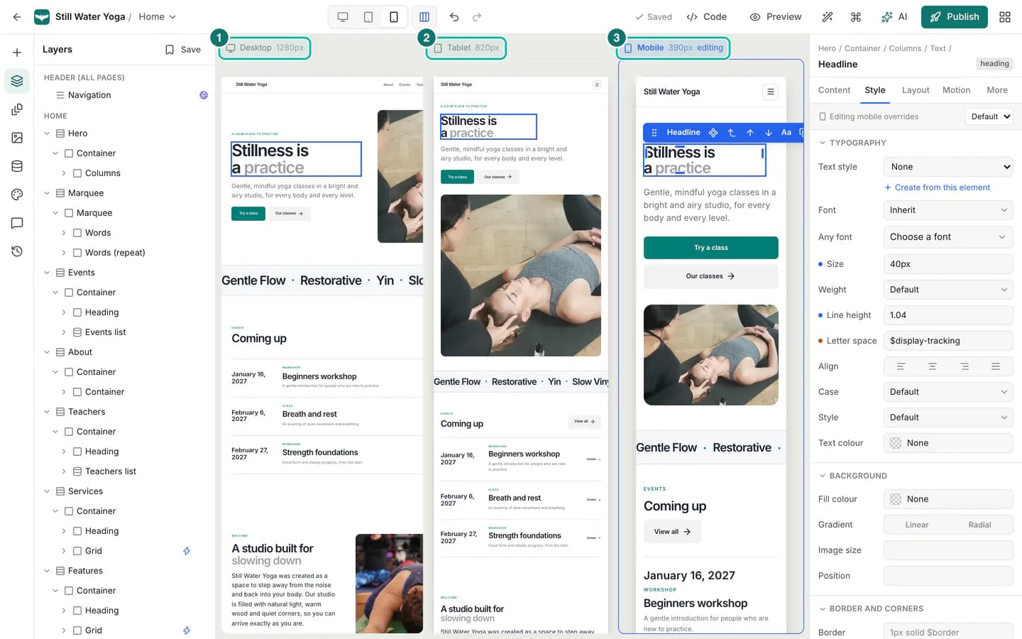
Sometimes one element needs to be different. Select it and open the Style tab. The strip at the top tells you which breakpoint you are editing: Editing desktop styles on desktop. Next to it, the State menu switches between Default, Hover and Focus, so you can style how a button looks when a visitor points at it.
The tab is grouped into Typography, Background, Border and corners and Effects. Size fields accept your theme's sizes such as $text-lg as well as plain values such as 18px, and colour fields accept theme colours, colour styles or any colour.
Step 12: Change the button shape for the whole site
Back in the Theme panel, the Shape group sets the corners and button style for the whole site. Choose Buttons: Solid, Soft, Outline, Pill or Sharp, or pick a Preset to set radius, shadows and buttons together. The radius fields (Radius sm, Radius md, Radius lg and Radius button) accept values such as 12px.
Spacing sets the Content width and the Section space (Compact, Balanced or Airy) for every page.
Tips and pitfalls
- Work from big to small. Try a style guide or a design direction first, then adjust theme colours and fonts, and only then style single elements. Changes at the top level carry through the whole site.
- Undo is your friend. Every theme change can be undone with ⌘Z, and a style guide is undone in one step. Saved versions in the history panel let you go back further.
- Two fonts are usually enough. One for headings and one for body text keeps pages calm and fast to load.
- Check contrast after colour changes. Light text on a light background is easy to miss on a bright monitor and hard to read on a phone in the sun.
- Mind font licences. Google Fonts are free to use on websites. For any other font, only upload it if your licence covers web embedding.
- Phones can differ. Styles you set on desktop apply everywhere unless you change them for tablet or phone. See Responsive design.
Summary
The Theme panel holds the look of your whole site. Apply a style guide from the style library to restyle everything in one undoable step, then fine tune the theme colours and pick heading and body fonts from the Google Fonts catalogue, or upload a font you are licensed to use. Colour styles and text styles let you name a look once and reuse it, and changing the style updates every linked element. Use the inspector's Style tab for one off changes and its State menu for hover and focus styles, and set button shapes and spacing for the whole site in Shape and Spacing.
Next, make sure your new look works on every screen with Responsive design, or bring it to life with Animation and motion.